The Power of Colour in Interior Design
Introduction
Have you ever wondered why you experience a sudden rush of energy when you walk into a workspace that has, perhaps, a vivid red as its accent wall? Or why do you instantly relax when you walk into a neutral living space? After love, if there is another language that can be accepted as a universal language, it’s got to be the language of colour. Colour choices are significant in interior design as they can either make or mar the look and feel of spaces. That’s why, when you’ve finally taken the plunge of decorating or redecorating your home or workspace, understanding the impact of your choices is of tremendous significance.
If all of this talk has overwhelmed you, don’t fret! This blog will discuss all you need to know about interior design. Here’s what this Studio A blog will cover:
- The Psychology of Colour
- Using to Create Focal Points
- Current Trends in Interior Design
The Psychology of Colour
While ‘the psychology of Colour ’ has been the buzzword in the world of marketing, advertising, and product design, interior design has the most to gain from this concept as people inhabit and embrace innovative and -consciously designed spaces.
So, what exactly is this ‘Psychology of Colour? Tracing its origins to Isaac Newton, who, in his 1704 book, Optiks, introduced the colour wheel and opined how a different wavelength of light perceives each colour, the linking of colours with emotions only happened in 1810 when Johann Wolfgang von Goethe published his seminal text, The Theory of Colors. This work brought in a wave of research that led to some significant developments in modern Color Psychology, the most prominent being the work of K. Goldstein, who put forth the idea that colours have the power to affect human emotions and behaviour.
Let us take a look, then, at what these different colours genuinely mean:
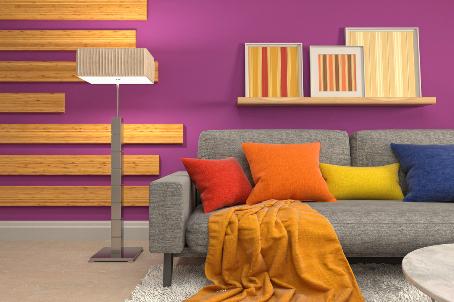
- Red: Red is a highly stimulating colour. It signifies love, power, passion, and vigour, among other things. Additionally, red is also believed to increase appetite. No wonder interior designs for most restaurant chains have red incorporated in their spaces!
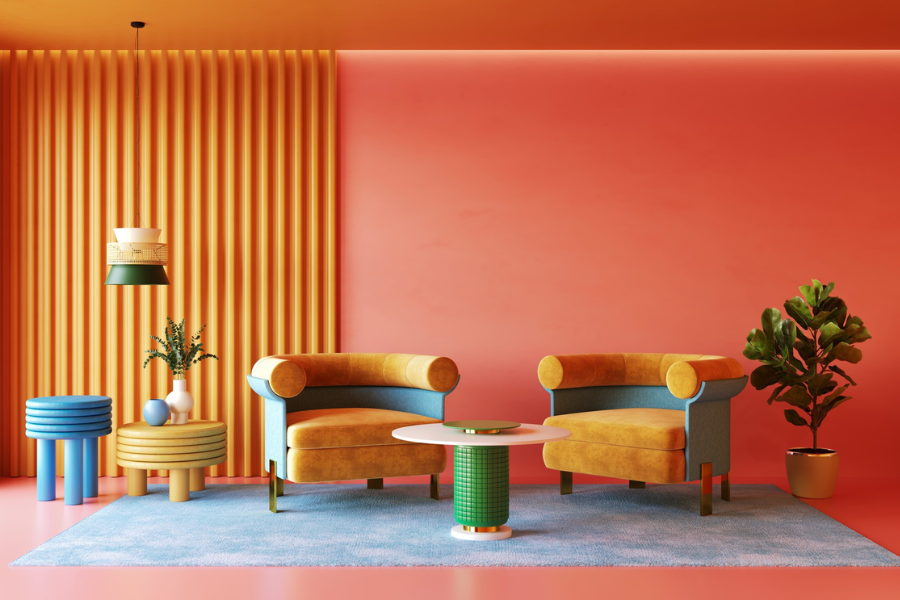
- Orange: Orange is said to be a mood booster. Associated mainly with energy, enthusiasm, happiness, and attention, orange stands out as one that boosts creativity. So, if you are a creatively inclined individual or one who owns, perhaps, an art studio, orange is one colour you must not rule out while designing your space.
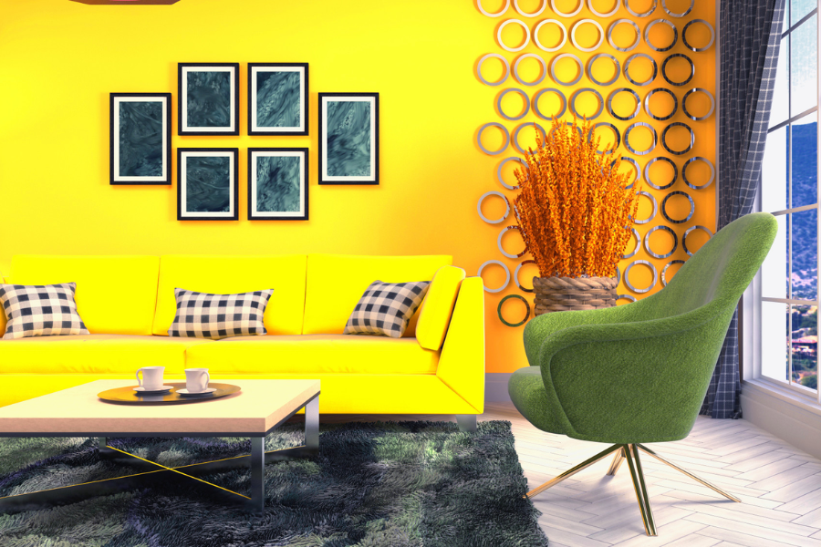
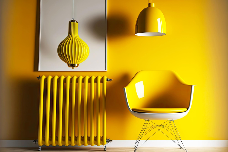
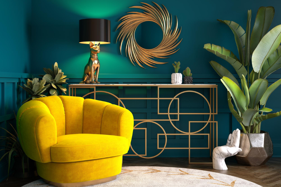
- Yellow: Majorly signifying vitality, optimism, warmth and brightness, yellow is a colour that also significantly increases concentration. Therefore, study rooms at home and educational institutions must note the colour yellow.
- Green: Associated with nature, growth, safety, and luck, the colour green also brings a sense of calmness. So, for example, if doctors wish to induce calm feelings in their anxious patients, they can consider painting their waiting rooms green.
- Blue: As opposed to red, blue is said to suppress appetite. Spaces that promote healthy living, like gyms or hospitals, can keep this in mind and design specific rooms accordingly. Moreover, blue is popularly linked to productivity, stability, and tranquillity.
- Purple: Purple is one colour that significantly helps with meditation and improves mental health, making it a preferred choice for places like yoga studios, mental health clinics, etc. Additionally, purple also symbolises mystery, imagination, wealth, and royalty.
- White: Largely associated with purity, innocence, and peace, white also highlights cleanliness, and it is perhaps all of these associations combined that health institutions like hospitals never fail to include white in their interior designs.
- Black: While black invokes a feeling of mystery, power, and boldness, it also exudes sophistication and class, making it the foremost interior design choice for corporate and technology firms.
After understanding s and their psychology, it is equally essential to comprehend hues, shades, tints, and tones. Why, you ask? Well, whether it’s interior design for rooms, like your kitchen, or your bedroom, for your entire home, or different workspaces, using only colours in their true form (which is what hues essentially are, by the way) is never the answer. Even if you choose to go with a monochrome look for your space, you will still have to mix and match your preferred hue (pures) with shades (adding black to a hue), tones (mixing grey with a hue) and tints (adding white to a hue; the opposite of a shade) of that hue.
If all this still seems overwhelming, remember this pro tip to begin decorating your space – if you’d like to make a room look bigger, use more tints. And if you prefer a room to look cosy, shades must be your go-to!
Only when all these colours, their hues, shades, tints, and tones work in unison can a colour-conscious interior design for any space be achieved.
Using Color to Create Focal Points
Now, with all this knowledge at your disposal, how will you put it to use? The simplest way, according to us, would be to connect with a Studio A expert ;), but just in case you’d like to take matters into your own hands, here’s how you can use colour to create focal points, i.e. draw attention to specific features or spaces in a room, in your personal interior design adventure!
The best way to understand focal points is through an example, and there’s no better example than Josh Radnor’s (Ted Mosby from “How I Met Your Mother”) LA home. In fact, Architectural Digest called it a “Colorful Traveler’s Paradise.”
Instead of painting an entire room in the colour of your choice, furniture pieces like sofas, cabinets, etc. and accessories like eye-catching artwork can pull the attention of anyone visiting. In JJosh” home, the kitchen cabinets are bold, blackened teal, aligning with his preference for making the room ooze with a sense of history.
Similarly, accent walls and floors can be focal points. JJosh’scorridor floor and accessories like small statues are brick red as opposed to his white walls. This contrast draws attention to his floor and simultaneously affords the room a monochrome effect.
Other architectural elements like ceilings, columns, and mouldings are also excellent choices for creating focal points. For instance, the beams in JJosh’s living room are painted a rustic bronze brown that perfectly complements the neutral white walls, resulting in a well-balanced, cohesive interior design.
Current Color Trends in Interior Design
While trends do evolve with time and reflect the choices and preferences of society as a whole, they are also cyclical. This means that what was in fashion some decades ago can still trend today, albeit with a modern twist.
Keeping this in mind, here is a list of the top 5 current colour trends in interior design:
- Warm Neutrals: With minimalist designs back in fashion, warm neutrals are all the rage, especially while designing living rooms and bedrooms!
- Soft Pinks and Violets: The perfect companion for almost all tones, soft pinks and violets seem to have never run out of fashion right since the 1700s!
- Rusts and Browns: Monochromes are trending again, and the browns have secured the top spot. Those tired of the minimalist wave can definitely jump on the rustic bandwagon with all browns!
- Deep Blues: Blues like ultramarine are complete no-brainers for accent walls; not to forget, they definitely vanish your blues away!
- Gold: No way to jazz up a room like gold! Mostly preferred on furniture, gold can also be an excellent choice for a kitchen or living room accent wall.
Conclusion
From choosing the right colours for the suitable spaces to understanding which colour to determine and where to create a focal point, the importance of colour and its psychology cannot be neglected. Lucky for you, we’ve done most of the groundwork. We hope this information helps you design your space color-consciously, one brushstroke at a time!
Image Reference: Freepik
Disclaimer: All trademarks, logos, and brand names are the property of their respective owners. All company, product, and service names used in this website are for identification purposes only. Use of these names, trademarks, and brands does not imply endorsement.
Content References: Stoneside, Webmd, Stewart-Schafer, Arch20, Livingetc